

Contents
Excel is a powerful tool for collecting, analyzing and presenting data. However, to make the most of Excel's features, you need to structure your data properly. In this blog post, we will show you how to structure collected data in Excel using some best practices and tips.
Why Data Structure Matters in Excel
Data structure refers to how you organize your data in a spreadsheet. A good data structure makes it easy to perform calculations, filter, and sort data, create charts and pivot tables, and apply formulas and functions. A bad data structure can lead to errors, confusion, and inefficiency.
How to Structure Collected Data in Excel
There are different ways to structure collected data in Excel depending on your needs and preferences. However, there are some general guidelines that you should follow for any type of data:
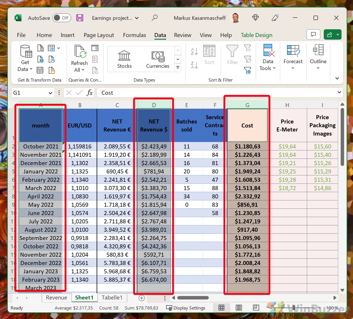
- Format your data like a database: This means that each row represents a record (such as a customer or a transaction) and each column represents a field (such as name or date). Avoid using blank rows or columns within your data range. Use one row for headers that describe what each column contains. Use consistent formatting for dates, numbers and text.
- Make sure all header rows are the same: If you have multiple tables of data in one worksheet, make sure that the header rows have the same names and order for each table. This will help you avoid confusion when referencing or combining different tables.
- Check that every row and column contains data: Do not leave any cells empty within your data range. If a value is missing or unknown, use a placeholder such as N/A or 0 instead of leaving it blank. This will prevent errors when applying formulas or functions that expect a value in every cell.
- Avoid using merged cells: Merging cells can make your spreadsheet look nice but it can also cause problems when sorting, filtering or applying formulas. Instead of merging cells, use alignment and indentation options to align your text within cells.
Determine the Type of Data
Before you begin organizing your data, it is important to determine the type of data you are working with. This will help you choose the best structure for your data. There are two main types of data:
-
Numeric Data: This type of data consists of numbers and can be used for calculations and statistical analysis.
-
Text Data: This type of data consists of text and can be used for descriptive analysis.
Using Scraped data in Excel
Scraped data is data that has been extracted from websites or other sources using various methods such as web scraping tools, APIs, or manual copying and pasting. Check out this Guide on scraping with Excel from Brightdata to learn more about this method.
Scraped data can be useful for various purposes, such as analysis, research, or reporting. However, scraped data may not always be in a format that is compatible with Excel or other spreadsheet applications. Therefore, it may require some preprocessing steps before it can be used in Excel.
Some of the common preprocessing steps for using scraped data in Excel are:
- Cleaning and formatting the data to remove any unwanted characters, spaces, symbols, or HTML tags that may interfere with Excel functions or formulas.
- Converting the data to the appropriate data type, such as text, number, date, or currency. This can help avoid errors or inconsistencies when performing calculations or operations on the data.
- Organizing the data into a structured table with clear headers and labels (see below). This can help improve the readability and accessibility of the data and enable features such as sorting, filtering, or pivot tables.
- Validating and verifying the accuracy and completeness of the data. This can help identify any missing values, duplicates, outliers, or anomalies that may affect the quality of the analysis or report.
By following these steps, one can use scraped data in Excel more effectively and efficiently.
Decide on the Data Structure
Once you have determined the type of data, you can decide on the best structure for your data. The most common data structures used in Excel are:
-
Flat Structure: This structure is best for data with a small number of variables. The data is organized in rows, with each variable in a separate column.
-
Relational Structure: This structure is best for data with a large number of variables. The data is organized in multiple tables, with each table representing a separate variable.
-
Hierarchical Structure: This structure is best for data with a hierarchical relationship. The data is organized in a tree-like structure, with each level representing a different variable.
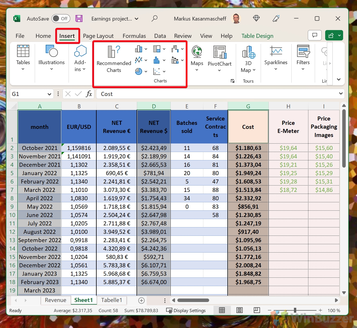
Create Headers and Labels
Headers and labels are essential for organizing your data in Excel. Headers are the names of your variables, and labels are the names of your data points. To create headers and labels, follow these steps:
-
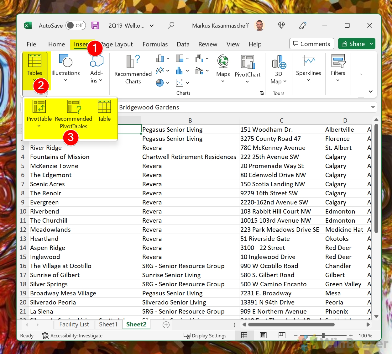
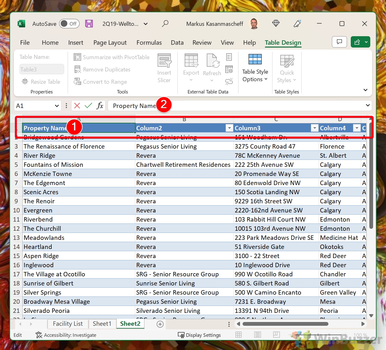
Select the first row and column of your data, then click the “Insert” tab and select “Table”.
-
Choose the style and formatting of your table.
-
Enter the headers and labels for your data.
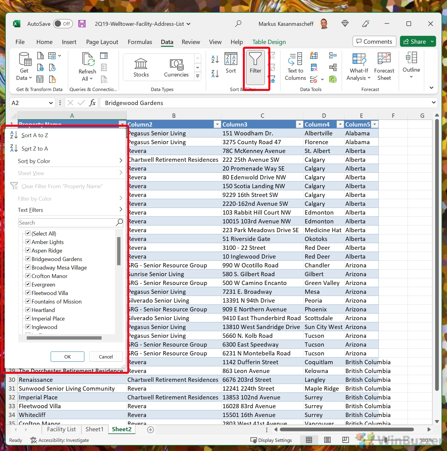
Sort and Filter Your Data
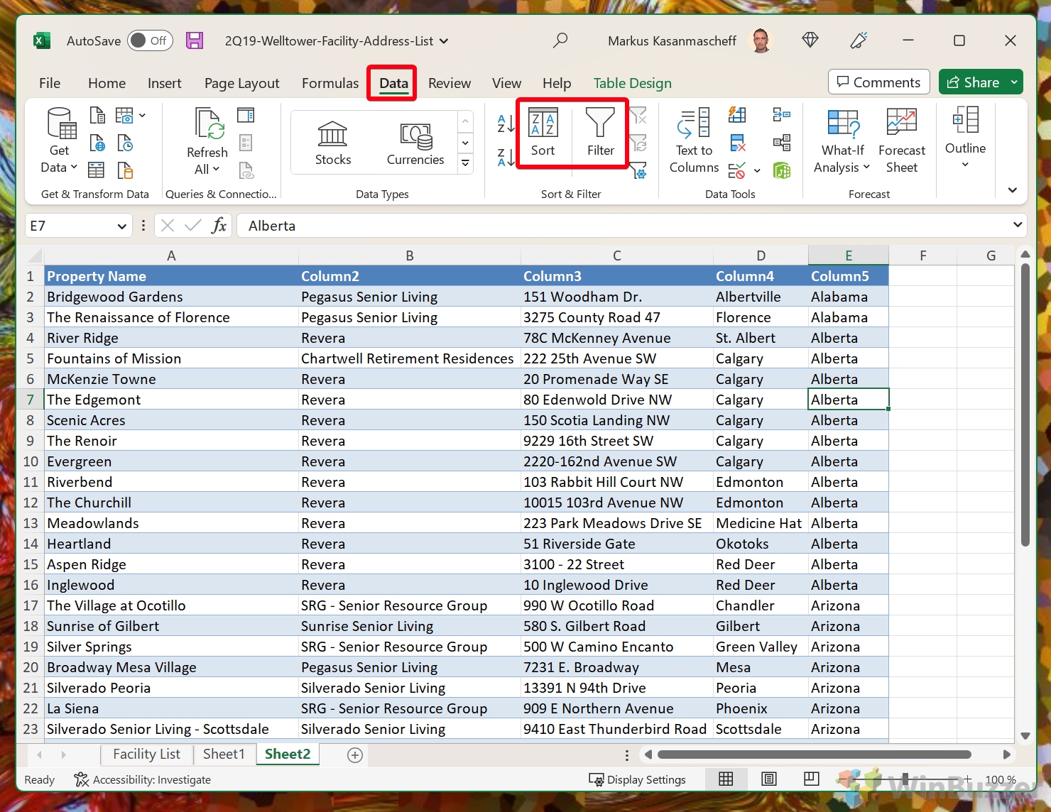
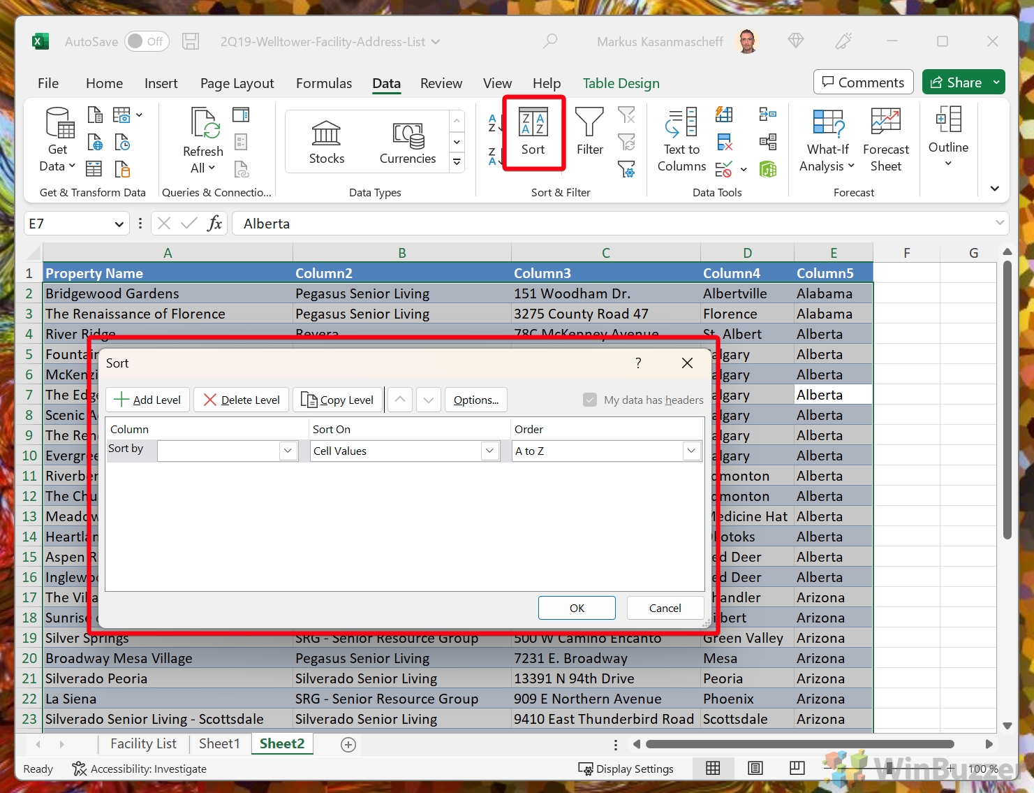
Sorting and filtering your data can help you find specific data points and analyze your data more effectively. To sort and filter your data, follow these steps:
-
Click the “Sort” or “Filter” button in the “Data” tab.
-
Choose the order you want to sort your data in.
-
Choose the criteria you want to filter your data by.
Formulas and Functions
Formulas and functions can help you analyze your data and perform calculations. To use formulas and functions, follow these steps:
-
Select the cell where you want to enter your formula or function.
-
Enter the formula or function in the formula bar.
-
Press “Enter” to calculate your result.
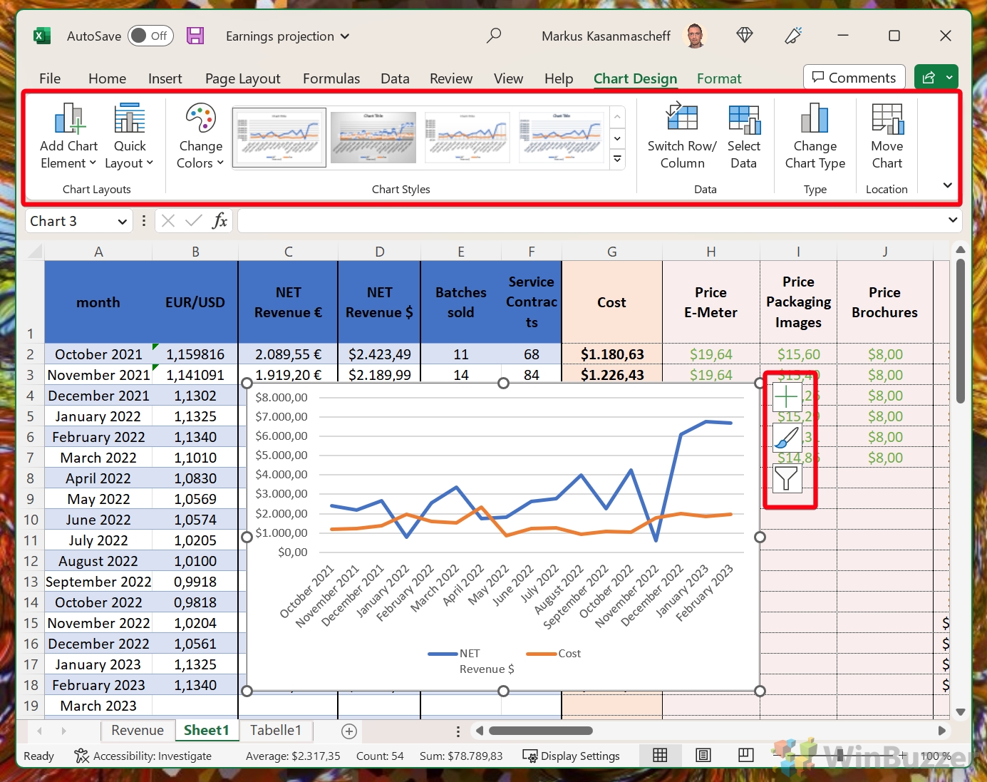
Use Charts and Graphs for Better Understanding
Charts and graphs in Excel can help you visualize your data and identify patterns and trends. To create charts and graphs, follow these steps:
-
Select the data you want to use in your chart or graph.
-
Click the “Insert” tab and select the type of chart or graph you want to create.
-
Choose the style and formatting of your chart or graph and customize your chart or graph as needed.


